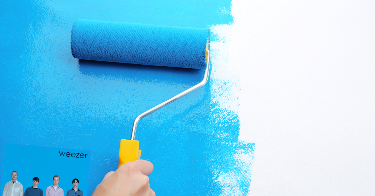
Some artists leave such an impression that their music begins to feel like home. Regardless of mood or situation, these bands transport you to a comfortable and cozy place. Today, we revisit Weezer’s discography because we’re thinking about repainting this room and we lost our color swatch.
“Weezer” (1994) – An undeniable classic, Weezer’s debut serves almost as a greatest hits album, containing some of their most identifiable anthems. It has a familiar, relaxing effect, one that might serve well if we decide to convert this room to a study. More importantly, it has the exact shade of “ironically distant blue” our partner had mentioned. It’s literally the perfect color for this room and we doubt any further albums will provide this level of satisfaction. But just in case, let’s listen to 13 more albums so we can get disappointed over and over.
“Pinkerton” (1996) – Another classic. Misunderstood when it came out, Weezer’s sophomore effort has become a hallmark of ’90s emo. Despite the name and our tendency to take things literally, the art has very little pink in it. This black and white color scheme simply isn’t going to work.
“Weezer” (2001) – While there may be some mild appeal here, we’re worried these tones may lead to an overall disappointing theme to the room. It’s a great shade of green, but honestly, now we just want something blue. It’s fine, but we’re gonna have to pass. We’d hate to paint the room and have it fail to live up to expectations.
“Maladroit” (2002) – Not great, not terrible. The soft coloration here could be good. We could use this for the sunroom. That room always seems like it should be fun but after spending 3-6 minutes in there, we remember why we leave this room alone.
“Make Believe” (2005) – We can’t imagine why anyone would paint a room like this.
“Weezer” (2008) – Yeah, we’d paint a room this shade of red too if we thought the room had something to prove. Look, we know some of these color schemes may be disappointing but this one almost approaches self-parody.
“Raditude” (2009) – This is self-parody, right? Or is this what it looks like when Weezer makes a joke unironically? Either way, the dog on the cover rules but our partner said no.
“Hurley” (2010) – Heh heh, remember Lost? Yeah, that was a good show. Lost. We even liked the finale, we think. We don’t think we’d want that guy’s face as our wall though.
“Everything Will Be Alright In The End” (2014) – Is this a real album? Weezer’s our favorite band and we have literally no memory of this.
“Weezer” (2016) – Look, we get it. They may have jumped the shark, but this one is actually pretty ok. Alright? It’s fine. And white is a pretty classic room color. You can do a lot with white. It would be great to paint a room like this if we didn’t want to overthink anything. Or maybe we’re just happy that it doesn’t look as shitty as we’ve grown to expect.
“Pacific Daydream” (2017) – Didn’t we already do this one? Oh, that was “Everything Will Be Alright In The End.” Shit, these guys have a lot of albums for a band with like 13 good songs.
“Weezer” (2019) – Teal? Fuck. This. Seriously, we wouldn’t paint the room this if our lives depended on it. We’re not so trite as to sacrifice our originality for some hokey nostalgia-fueled cash grab. Say what you will about how shitty some of these albums were, at least they were original. WE DON’T NEED A COVER OF AFRICA!
“Van Weezer” (2021) – This comes out next year but we’re gonna go ahead and give this one a “no,” unless the “van” in question is on the album cover and it’s airbrushed by Frank Frazetta. If so, we’re going with that for the baby’s new room.

